
- College majors with the highest unemployment rates explained
- Why "major" is the wrong unit for ranking job risk
- How to evaluate any "highest unemployment college majors" list
- What unemployment rates by college major leave out
- A step-by-step way to research your own major's real risk
- What the data can and can't tell you about underemployment and cost
- Your next step
College majors with the highest unemployment rates explained
Search "college majors with the highest unemployment rates" and lists appear within seconds, ranking specific fields as the riskiest for job seekers. None of those rankings comes from a single government report. The Bureau of Labor Statistics tracks unemployment by education level, not by field of study, so a major-specific number usually starts as someone's calculation from Census survey data, built on choices about age range, time period, and population that most publishers never explain.
Hiring headlines add urgency to that search. The July jobs report showed nonfarm payrolls down by 23,000, following an average monthly gain of 34,000 over the prior 12 months, and revisions cut the previously reported May and June gains by a combined 103,000 jobs (BLS, 10 days ago). When numbers like that circulate, the pull toward a quick answer about which majors carry more risk gets stronger, even though that quick answer sits on shakier ground than it looks.
The strongest government data on education and unemployment does show a real gap, just not the one most rankings imply. Adults 25 and older with a bachelor's degree or higher had a 2.8% unemployment rate in April, compared with 4.7% for high school graduates and 6.4% for people without a diploma (BLS, 3 months ago). That gap is measured by attainment level. It says nothing about major or field of study.
This guide isn't another ranking. It's a way to evaluate any major-unemployment list already circulating, understand where the underlying numbers actually come from, and build a research process around a specific target occupation instead of leaning on one figure attached to a degree program.
Why "major" is the wrong unit for ranking job risk

BLS's unemployment-by-education series sorts adults into four broad tiers: no diploma, high school graduate, some college or an associate degree, and bachelor's degree or higher. It stops there, without breaking results out by field of study (BLS, 3 months ago). Whatever major-specific figure a ranking quotes is coming from somewhere else entirely.
The Census Bureau publishes American Community Survey data every year, accessible through data.census.gov, including Data Profiles that summarize social, economic, housing, and demographic characteristics for a chosen geography (U.S. Census Bureau, 8 months ago). That's a substantial, regularly updated dataset. It isn't a ready-made ranking of unemployment by major, and turning it into one requires methodology decisions the Bureau's own description never spells out for a publisher.
Even a carefully built estimate runs into a structural problem: a major and an occupation rarely line up one to one. A psychology degree can lead to research roles, human resources, school counseling, or sales work, jobs with very different hiring conditions. Average all of that into one "psychology unemployment rate" and the number ends up describing no one's actual job search particularly well. The reverse holds too. Employers hiring for the same job title often draw from several different majors, so an occupation's outlook can't be read off one degree program either.
Major-level data still has some value for spotting a broad pattern, but it was built for broad comparison, not for the decision a specific job seeker is trying to make. Occupation-level data, covered further down, does more of that work.
How to evaluate any "highest unemployment college majors" list

Before a published ranking changes any decision, run it through a short set of questions.
- Who is being measured? Some estimates cover everyone who ever earned a degree in a field. Others try to isolate recent graduates. These are different populations with different outcomes, and neither BLS's education-level series nor Census's ACS publishes a ready-made "recent graduate" breakout. A ranking claiming to isolate new grads needs to show its own methodology, not just point back to a national average.
- What time period, and what counts as unemployed? A single month's snapshot can look calmer than the underlying trend. The same July report that showed a flat 4.1% national unemployment rate also came with a combined 103,000-job downward revision to the two prior months (BLS, 10 days ago). A ranking built on one favorable month tells a different story than one averaged across several years.
- How was the estimate built, and does the publisher say so? Turning raw ACS tables into a major ranking means choosing which years to pool, which age range to include, whether the population covers only people in the labor force or everyone who ever earned the degree, and whether the geography is national or narrowed to a state. Two different "highest unemployment majors" lists can draw on the same underlying Census data (U.S. Census Bureau, 8 months ago) and still measure different populations across different years without saying so.
- Is the sample size mentioned anywhere? Narrower majors surveyed through Census data can produce numbers worth checking against a larger sample or a longer time span before treating them as settled.
If a ranking skips over these questions, treat it as a headline rather than a research finding. Apply that same scrutiny to your own field before you act on it.
What unemployment rates by college major leave out
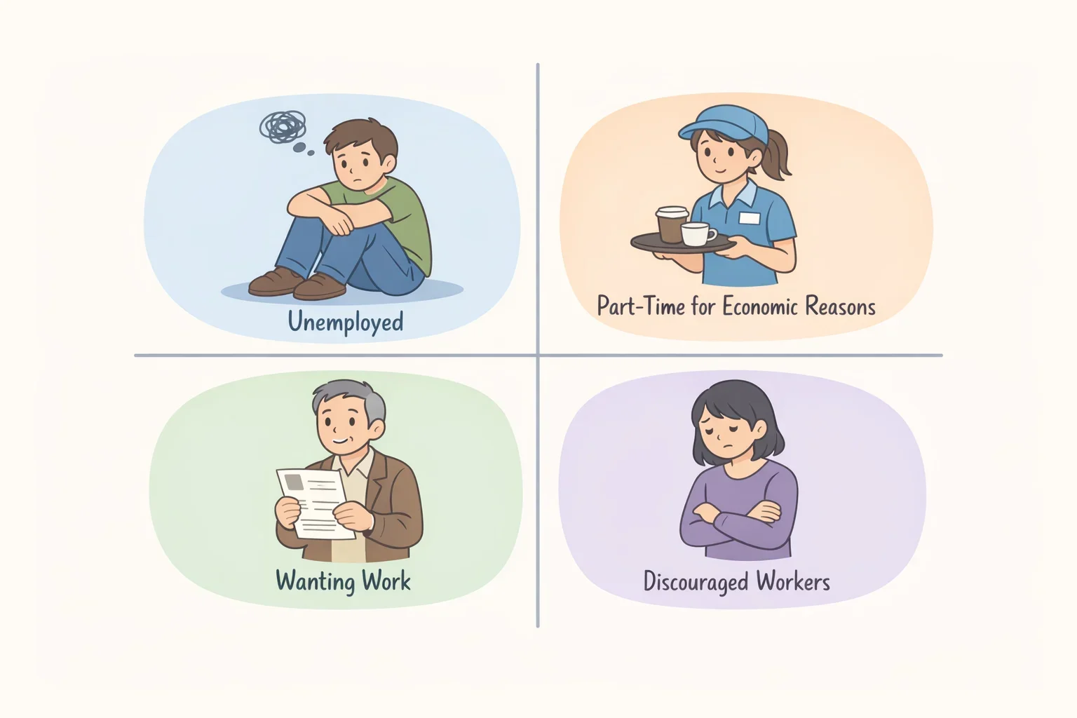
The headline unemployment rate is narrower than it looks, and the gap between what it counts and what it leaves out shapes how any major-level number built on top of it should be read.
In July, 6.9 million people were counted as unemployed, and the unemployment rate held at 4.1% (BLS, 10 days ago). Several related groups don't show up in that figure at all. Another 4.8 million people were employed part time for economic reasons that month (BLS, 10 days ago). Separately, 5.9 million people said they wanted a job but weren't counted among the unemployed, and of that group, 476,000 were discouraged workers who believed no jobs were available for them (BLS, 10 days ago).
Duration matters too. Long-term unemployed people, meaning those jobless for 27 weeks or more, made up 25.5% of all unemployed people in July (BLS, 10 days ago). The overall rate doesn't show how long people have been out of work, so a stable headline number and a harder road back for the longest-jobless workers can both be true at once.
Underemployment, covered further down, is a separate measure again. A major ranking that reports only an unemployment figure stays silent on all of this: how many people are working fewer hours than they want, how many gave up the search, and how many landed a job that doesn't touch their degree at all.
A step-by-step way to research your own major's real risk
Step 1: Reframe the question from "major" to "occupation." List two to four realistic occupations tied to your field of study. O*NET and the Occupational Outlook Handbook describe what a job involves and its typical entry-level education, but matching a specific major to a short list of likely occupations still takes judgment, drawn from coursework, internships, and job titles you've actually seen posted.
Step 2: Pull growth and openings as separate figures. For each occupation, look up the Occupational Outlook Handbook's projected growth rate and its projected number of annual openings. These answer different questions: a slow-growing occupation can still post plenty of openings simply because workers retire or move on. Keep the two numbers separate, and remember both are national projections, not a measure of hiring conditions in your specific city or state.
Step 3: Check current local postings against the handbook's stated requirements. Search your target metro or state for listings in each occupation and compare what employers ask for against the handbook's entry-level education. Employers sometimes list a certification, portfolio, or advanced degree the handbook doesn't count as required. Record any qualification that comes up more than once as a signal worth investigating further, not proof that it's required everywhere. Three to five postings can illustrate local expectations. They can't establish what an entire field requires nationwide.
Licensing is where a mistaken assumption gets expensive fastest. Occupations in fields like counseling, therapy, or other clinical work often require a state license, and the required degree level, supervised experience, and exam differ by state and by which specific license applies to the role. Don't rely on a general impression of what a bachelor's degree qualifies someone to do. Contact the licensing board in the state where you plan to work and ask directly what license the role requires, what education level it demands, and what supervised hours or exams are part of the process.
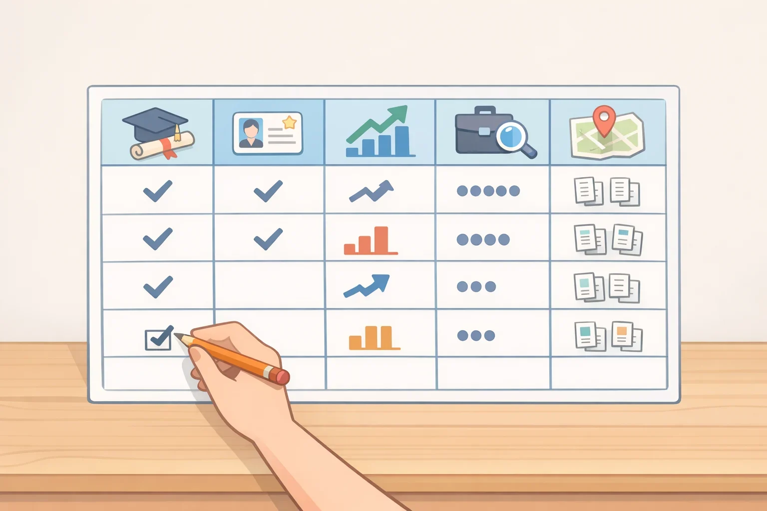
Step 4: Put the results in a table before drawing conclusions.
Target occupation Typical entry education License required in my state? Projected growth Annual openings Local postings reviewed / date Repeated preferred qualifications Wage measure / source Next action
Growth, openings, current postings, and wages each measure something different, and the table only works if that stays clear. Growth and openings come from the Occupational Outlook Handbook's national projections. Current postings show what employers in your market are asking for right now, not a statistical measure comparable to a government estimate. For the wage column, note whether the figure is a median (the midpoint of all wages), an average (which a small number of high earners can pull upward), or a range pulled from a handful of postings, and record the source next to the number.
A psychology major weighing market research analyst, HR specialist, and substance abuse counselor roles might find, once local postings are checked directly, that one role lists a preferred certification across several listings in one metro while a nearby metro shows no such pattern, or that the counseling role calls for a graduate degree locally even though the handbook lists a bachelor's as the typical national entry point. Differences like that only show up once postings are checked directly. They can't be assumed from a general description of the occupation.
Filling in that table with current Occupational Outlook Handbook figures and postings pulled from an actual target market, rather than a single national "psychology unemployment rate," is the output this process should produce. It turns one imprecise ranking into several occupation-specific pictures tied to a real location and a real target job.
What the data can and can't tell you about underemployment and cost
Underemployment, meaning working in a job that doesn't require or use a bachelor's degree, is a separate measure from unemployment, and researchers don't agree on how to define it. Published estimates for bachelor's-degree holders range from 25% to 52% depending on methodology (Georgetown CEW, 6 months ago).
Georgetown's Center on Education and the Workforce shows why that range is so wide. Using BLS's entry-level education assignments alone puts the rate at 37% for full-time, full-year workers ages 25 to 54 with a bachelor's degree. Accounting for the wage premium employers pay degree-holders in the same occupation, evidence that many employers value the degree even where it isn't formally required, brings that same estimate down to 22% (Georgetown CEW, 6 months ago). The method alone moves the answer by 15 percentage points.
A high underemployment estimate points to weaker outcomes for a defined group over a specific period. It doesn't establish that a major was a poor choice, and it doesn't predict what happens to any one graduate. Location, the specific occupation targeted, internship experience, and willingness to add a credential can shift where an individual lands, even within a field carrying a high published estimate.
Cost and time to entry belong in the decision alongside any outcome numbers. A major with mixed unemployment or underemployment figures can still make sense if it opens several jobs without additional schooling. A field with strong headline numbers can still be the harder path if it requires an expensive master's degree or a licensing exam that adds years and debt before someone can work in it at all.
If a comparison table shows weak numbers for the occupations targeted, abandoning the major isn't the only option. Pairing it with a marketable technical skill, targeting an adjacent occupation with better projected openings, testing the field through an internship before committing further, or pricing out the earnings gain of an added credential against its cost can all change the outcome the raw numbers suggest.
Your next step
Skip the search for a single "highest unemployment majors" list and build the comparison table instead. Pick two to four occupations tied to the major in question, pull entry education and projected openings from the Occupational Outlook Handbook, and check three to five current local postings for each one. Confirm any licensing requirement directly with the relevant state board rather than assuming a degree alone qualifies someone for the role.
Verify entry requirements with official sources and compare current local postings before paying for an added credential or an extra year of school. A table built around an actual location and actual target occupations says more about real risk than any national ranking can, and it's the version of this research that leads to a decision instead of another headline.
